Meta Viewport Tag: Essential for Mobile-Responsive Websites
Learn how the meta viewport tag makes your website mobile-friendly. Understand width, initial-scale, and viewport properties for responsive design.
Table of Contents
- Introduction
- What is the Meta Viewport Tag?
- Why the Viewport Meta Tag Exists
- How Developers and Businesses Use It
- Key Viewport Properties Explained
- Comparing Viewport Implementation Across Platforms
- Common Mistakes and Troubleshooting
- Impact on SEO and Mobile Rankings
- Viewport Tag and Responsive Design Workflow
- Mobile Viewport Versus Desktop Viewport
- Future of Viewport Configuration
Introduction
The meta viewport tag is a crucial piece of HTML that manages how your website appears on mobile devices. Without it, your site could look tiny and unreadable on phones and tablets. This tag tells browsers how to adjust the page dimensions and scaling to suit different screen sizes. Before the advent of smartphones, websites were designed only for desktops. As mobile browsing became prevalent, developers needed a solution for adapting sites to smaller screens. The viewport meta tag emerged as the solution, and it is now a standard part of responsive web design. Every modern website should include this tag in the HTML head section. Key properties include width, initial-scale, maximum-scale, minimum-scale, and user-scalable, which dictate how your content fits and behaves on mobile devices.
What is the Meta Viewport Tag?
Mobile Viewport Behavior:
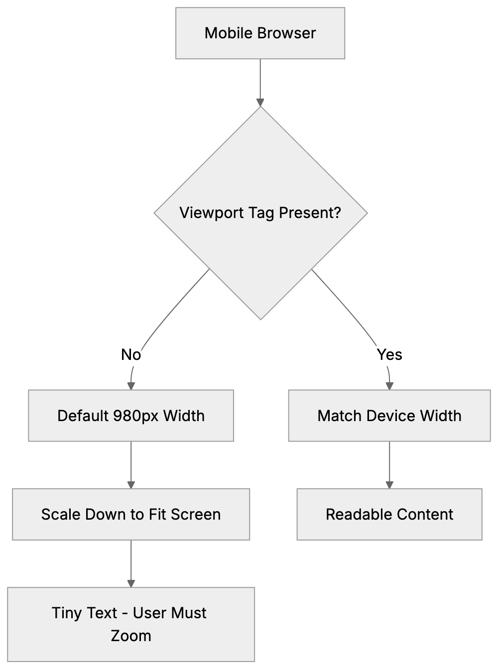
The viewport meta tag is an HTML element placed in the head section of your webpage. It appears like this: <meta name="viewport" content="width=device-width, initial-scale=1.0">. The viewport is the visible area of a web page on a device screen. On desktops, it is the browser window, while on mobile devices, it’s the entire screen minus system UI elements. Without the mobile viewport tag, mobile browsers render pages at desktop widths, then shrink everything to fit the screen, making text very small and forcing users to frequently zoom in and out. The tag corrects this behavior by telling the browser to match the page width to the device screen width, enhancing readability without zooming. However, it doesn’t make your site responsive by itself. You still need CSS media queries and flexible layouts, but the responsive design meta tag provides the foundation for these techniques to work properly.
Why the Viewport Meta Tag Exists
Before mobile devices had full web browsers, this tag wasn’t required. Early smartphones in the mid-2000s started to include full web browsers, yet most websites remained designed for desktop screens over 1024 pixels wide. Mobile browsers had a problem displaying these sites since the content was aimed at much larger screens. To counteract this, mobile browsers rendered pages at a default width of 980 pixels and then shrunk the entire page to fit on small screens, preserving desktop layouts but making everything tiny. Users had to zoom to read text or click links, which was functional but not ideal. Apple introduced the viewport meta tag with the iPhone in 2007 to give developers control over this behavior, enabling designs specifically for mobile-friendly websites. As responsive design techniques evolved, the tag became essential and is now a requirement for mobile-friendly websites. Google even uses mobile-friendliness as a ranking factor.
Viewport Tag Impact on Page Rendering:

How Developers and Businesses Use It
Web developers incorporate the viewport meta tag into every HTML page they create, typically placing it in the head section, near other meta tags. The common configuration is <meta name="viewport" content="width=device-width, initial-scale=1.0">, setting the page width to match the device screen width. The initial-scale=1.0 ensures the page loads at a 100% zoom level. Some developers add more properties like maximum-scale or minimum-scale to manage how much users can zoom. However, disabling zoom entirely with the user-scalable property is discouraged due to accessibility concerns. CMS platforms like WordPress, and e-commerce sites like Shopify and Wix, have this tag included by default, allowing small business owners to benefit without understanding the technicalities. Marketing professionals and SEO experts check for the viewport tag during website audits, as missing it indicates the site isn’t optimized for mobile devices.
Key Viewport Properties Explained
The viewport meta tag accepts several properties within its content attribute, each controlling different aspects of mobile display. Understanding these helps to configure the tag correctly for your needs.
- Width: This controls the viewport width. Setting it to “device-width” aligns the viewport with the device’s screen width in CSS pixels. Avoid using specific pixel values like “width=600” as it negates the purpose of responsive design.
- Initial-scale: This adjusts the zoom level when the page first loads. A value of 1.0 indicates 100% zoom, which is standard. Values less than 1.0 zoom out, while greater values zoom in. Most sites use 1.0.
- Maximum-scale: Limits how much users can zoom in. A value of 2.0 allows zooming to 200%. Restricting zoom can impact accessibility.
- Minimum-scale: Limits how much users can zoom out, usually matching
initial-scale. - User-scalable: Accepts “yes” or “no” values; “no” disables zooming, which can negatively affect accessibility and UX.
The standard setup typically includes width and initial-scale. A typical tag is <meta name="viewport" content="width=device-width, initial-scale=1.0">, covering most use cases.
Comparing Viewport Implementation Across Platforms
Various website platforms handle the viewport meta tag differently. Here’s a comparison:
| Platform/Framework | Default Viewport Tag | Customizable | Auto-Included |
|---|---|---|---|
| WordPress (Modern Themes) | width=device-width, initial-scale=1.0 | Yes, via theme files | Yes |
| Shopify | width=device-width, initial-scale=1.0 | Yes, via theme.liquid | Yes |
| Wix | width=device-width, initial-scale=1.0 | Limited | Yes |
| Squarespace | width=device-width, initial-scale=1.0 | No | Yes |
| HTML/CSS (Manual) | Must add manually | Full control | No |
| Bootstrap Framework | width=device-width, initial-scale=1.0 | Yes, in starter template | In examples |
Responsive Design Workflow:
WordPress automatically includes the viewport tag in themes built after 2014. Shopify also includes it by default, modifiable via the theme.liquid file. Wix and Squarespace handle viewport settings automatically without user customization. For custom HTML sites, developers must add the tag manually to every page.
Common Mistakes and Troubleshooting
Several common errors arise when implementing the viewport meta tag. Here are key points:
- Missing Tag: Without the tag, your site won’t display properly on mobile devices.
- Fixed Width Values: Using fixed width values instead of
device-widthimpairs responsiveness. - Disabling Zoom: Using
user-scalable=noormaximum-scale=1.0could breach accessibility guidelines. - Multiple Tags: Multiple viewport tags cause conflicts. Ensure there’s only one viewport meta tag.
- Syntax Errors: Ensure the correct syntax with proper property=value pairs.
To verify the viewport tag, use browser developer tools or Google’s Mobile-Friendly Test tool.
Impact on SEO and Mobile Rankings
Google considers mobile-friendliness a ranking factor in search results, and the viewport meta tag contributes to this. Without it, your pages might not rank well in mobile search results. Google’s algorithm checks for the presence and proper configuration of this tag, and mobile-first indexing highlights the importance of a good mobile experience.
Sites lacking a properly configured viewport tag may face ranking penalties, as poor mobile usability affects page experience signals. SEO experts include viewport tag verification in audits, as its absence can indicate outdated or technically flawed sites. For content marketers, the viewport tag ensures your content remains visible, even on mobile devices.
Viewport Tag and Responsive Design Workflow
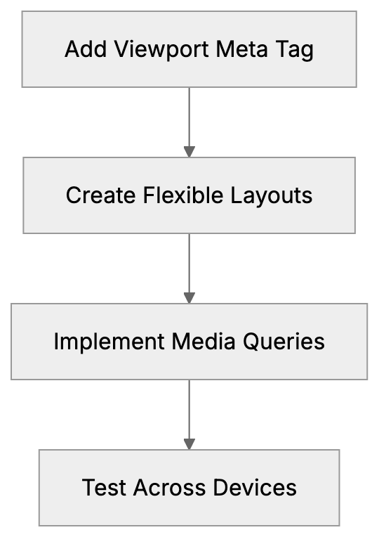
The viewport meta tag is integral to the broader responsive web design process, which includes flexible grids, flexible images, and media queries. Here’s a brief on how developers typically implement responsive design using the viewport tag:
- Add the viewport meta tag to HTML head sections for foundational responsive behavior.
- Create flexible layouts using CSS, employing percentage widths instead of fixed pixels.
- Implement CSS media queries for breakpoints targeting different device sizes.
- Make images and media flexible, using max-width: 100% to prevent overflow.
- Test on various devices or browser emulation to ensure proper display across screens.
Mobile Viewport Versus Desktop Viewport
The concept of the viewport differs between mobile and desktop browsing. On desktops, it’s the browser window size, which users can resize freely. On mobile, the viewport equals the screen size minus UI elements and can’t be resized. Without the viewport meta tag, mobile browsers create a virtual 980-pixel-wide viewport, scaling the page down to fit small screens.
The viewport meta tag ensures mobile browsers use the actual screen width instead of a virtual size. Desktop browsers largely ignore the tag, using the window size as the viewport, but it remains crucial for mobile devices. Tablets occupy a middle ground, with viewport tags typically applied similarly as for phones.
Future of Viewport Configuration
The viewport meta tag has remained stable over time, with the standard width=device-width, initial-scale=1.0 setup still being best practice. Though the CSS Working Group considered moving viewport configurations to CSS, limited browser support led to the proposal’s deprecation.
As new devices such as foldable screens emerge, viewport configurations must adapt, but the meta tag handles these transitions by updating the device-width value. For traditional websites on phones, tablets, and desktops, the viewport meta tag remains a stable and reliable standard.
Overall, the viewport meta tag is a small yet crucial code piece for modern websites. It ensures your site displays correctly on mobile devices by setting the viewport width device-width, critical for responsive web design. Its presence can significantly impact mobile usability and search rankings, requiring developers and business owners to prioritize its implementation.
Frequently Asked Questions
What happens if I don’t include the viewport meta tag in my website?
If you omit the viewport meta tag, your website may not display correctly on mobile devices. Instead of adjusting to the mobile screen size, browsers will render the page at desktop dimensions, resulting in tiny text and requiring users to zoom in and out frequently.
Can I customize the viewport settings for different web pages?
Yes, you can customize the viewport tag for individual web pages by modifying the content attribute. This allows you to set different widths or scaling options based on the needs of specific pages. However, it's important to maintain usability and accessibility across all pages.
How do I check if my website has a properly configured viewport meta tag?
You can use browser developer tools to inspect the head section of your website. Additionally, Google’s Mobile-Friendly Test tool evaluates your site, including checking for the presence of the viewport meta tag and its proper configuration.
What are the risks of disabling user scaling in my viewport settings?
Disabling user scaling with the user-scalable property set to 'no' can negatively impact accessibility. Users with visual impairments may rely on zoom functions to better view content, so restricting this option could make it difficult for them to interact with your site.
Why is mobile-friendliness important for my website's SEO?
Mobile-friendliness is a ranking factor for search engines like Google. Websites that don’t display properly on mobile devices may receive lower rankings in search results, impacting visibility and user traffic. A properly configured viewport tag contributes significantly to a favorable mobile experience.
What common mistakes should I avoid when using the viewport meta tag?
Common mistakes include missing the tag entirely, using fixed width values instead of 'device-width', and incorrectly allowing multiple viewport tags on a page. Each of these errors can lead to display issues and hinder the responsiveness of your website.
How does the viewport meta tag interact with responsive design techniques?
The viewport meta tag provides the necessary foundation for responsive design, but it works best when combined with CSS media queries and flexible layouts. This collaboration ensures your website adapts effectively to various screen sizes, enhancing user experience across devices.